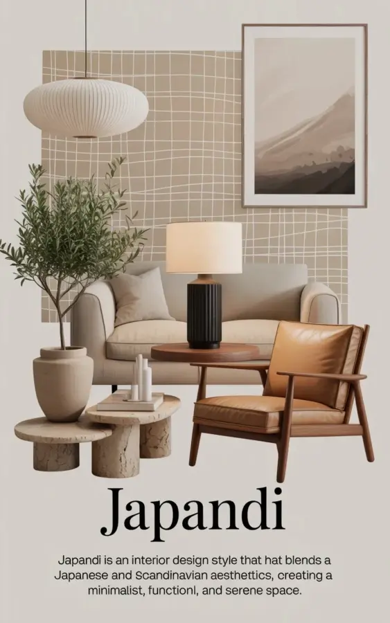
If you are drawn to Japandi design, you probably love the calm, minimalist look that blends Scandinavian simplicity with Japanese warmth. But there is one mistake I see over and over again, even in beautiful neutral homes: forgetting to layer textures. Without that thoughtful mix of materials, a Japandi room can feel flat, cold, or worse, like a showroom. That mood board you see here? It nails the balance. The woven pendant light, leather armchair, and textured side table work together to create a space that feels cozy and lived in, not clinical. Let me walk you through exactly how to avoid this common pitfall.
The One Texture Layering Mistake That Makes Japandi Feel Lifeless
The biggest error people make is treating neutrals as a single flat color story. They pick one shade of beige for the sofa, one white for the walls, one wood tone for the floor, and call it done. But a room without texture contrast reads as unfinished, not serene. It is the difference between a warm hug and a waiting room.
I have seen so many homes where the owner bought all their furniture from the same sleek, smooth-finish collection. Everything matches, but nothing feels inviting. The magic of Japandi comes from pairing rough with smooth, soft with hard, matte with a hint of sheen. The mood board above shows this perfectly. Notice the white woven pendant light adds an airy, tactile contrast against the solid beige upholstered sofa. That is not random. That is intentional layering.
Why Texture Layering Matters More Than You Think in Japandi
Texture is what gives a neutral palette its personality. When you strip away color, the eye relies on surface variation to create interest. A room done right feels rich and multidimensional without adding a single bright pillow or patterned rug. This is especially important in Japandi because the style celebrates imperfection and natural materials. You want to see the grain in the wood, feel the weave in the fabric, and notice the slight unevenness of a hand-thrown ceramic.
In the mood board, the wooden armchair with tan leather upholstery brings in two textures at once: the smooth, warm grain of the wood frame and the supple, slightly aged leather seat. That combination alone adds more depth than a dozen decorative objects could. The textured side table next to it? It grounds the composition and keeps things from feeling too polished.
5 Essential Textures for Every Neutral Japandi Room
You do not need an endless list of materials. Stick to these five, and you will have a solid foundation for any neutral space.
- Woven natural fibers. Think rattan, bamboo, jute, or the white woven pendant light from the mood board. They introduce organic lines and a slightly irregular surface that softens straight edges.
- Leather or faux leather. A single leather piece, like the armchair in the image, adds a rich, tactile contrast to soft fabrics. Look for matte, unpolished finishes for a more subdued look.
- Textured ceramics and stone. The side table with a rough, carved surface is a perfect example. Unglazed pots, stoneware vases, or a fluted ceramic planter all work wonderfully.
- Soft, looped or nubby fabrics. Linen, wool, bouclé, or a chunky knit throw. The beige upholstered sofa in the mood board likely has a subtle weave. These fabrics absorb light and add quiet warmth.
- Matte metal and wood grain. The black cylindrical lamp with its white shade introduces a slight sheen, but it is not shiny. Pair that with the warm wood of the armchair and the natural grain of a side table to balance the softer textures.
How to Layer Textures Without Cluttering Your Japandi Space
Layering does not mean piling on. The goal is to create visual rhythm, not chaos. Start with your largest piece, usually the sofa or bed. Choose a fabric with visible texture, like a linen blend or a ribbed weave. Then add one piece with a contrasting surface, such as a leather armchair or a wooden coffee table. The mood board does this beautifully. The beige sofa is soft and solid. The woven light overhead is light and open. The tan leather chair is warm and structured. Each material feels distinct but harmonious.
A good rule of thumb is to use no more than three to four different textures in a single view. Group them so they feel intentional. For example, place the textured side table next to the leather chair and let the matte lamp sit on it. Keep the background clean, like the beige textured wall panel in the mood board, so the foreground textures pop without competing.
The Secret Weapon: Add One Natural Element
Every Japandi mood board benefits from something alive. In this image, it is the large potted olive branch in a beige ceramic planter. A single branch or a small tree adds a soft, organic silhouette that breaks up rigid lines. It also introduces a slight green tint that is still neutral enough to stay within the palette. Do not underestimate what a piece of nature can do. If you do not have space for a plant, try dried eucalyptus or a sculptural branch in a tall vase. That natural element becomes the focal point that ties all your textures together.
Your Neutral Palette Needs These Three Tones
Texture works best when the colors stay restrained. For a Japandi look, stick to a base of three neutral tones. Start with a warm off-white or cream for larger surfaces like walls and sofas. Then add a mid-tone beige or taupe (like the sofa in the mood board) for secondary pieces. Finally, bring in a darker accent, black or deep charcoal, for contrast. Notice the black cylindrical lamp and the black frame of the abstract art in the image. That darkness grounds the lighter neutral layers and prevents the room from feeling washed out.
If you want a fourth tone, use a very pale olive or sage, but only in small doses, like the olive branch leaves. The key is to keep everything within the same warm family. Cool grays will clash with the leather and wood. Stick to beiges, creams, warm whites, and soft browns.
A Simple Japandi Mood Board Formula You Can Copy
Inspired by the image above? You can create your own mood board or tabletop scene without being an interior designer. Pick one large soft piece, like a beige sofa or a linen-covered bed. Choose one woven lighting fixture, a pendant or a floor lamp with a natural shade. Add one leather or wooden accent chair. Place a textured side table or a small stool next to it. Top the table with a matte black or warm gray lamp. Finish with one living element, an olive branch, a fiddle leaf fig, or a vase of dried grasses. Tuck a piece of abstract art with neutral tones somewhere in the background. That is the whole formula. It works every time.
Try photographing your own setup or sketching it out. You will see how each texture supports the next, no clutter required.
Getting the textures right is what transforms a basic neutral room into a true Japandi retreat. It is not about spending more money or buying more things. It is about choosing pieces with intention and letting their surfaces do the talking. The next time you arrange a corner or shop for a new piece, ask yourself: does this add a new texture or just repeat what I already have? That small shift in thinking will make all the difference. Save this pin if you found it helpful, and please share your own texture layering experiments with me. I would love to see what you create.
#japandi #neutralhomedecor #scandiminimalist #interiordesigninspo #texturelayering
Leave a Comment