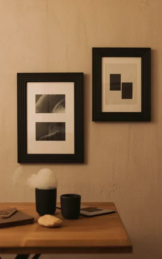
Look, the biggest minimalist wall art mistake I see people make is hanging too many small pieces that fight for attention. It creates visual noise, not calm. And that’s the opposite of what Scandi style demands. Honestly, I’ve done it myself. I once spent an entire afternoon rearranging six tiny thrifted frames on my wall, stepping back, adjusting, stepping back again until my neck ached. The result? A cluttered mess that made my small living room feel even smaller. That’s when I realized the real secret: a curated pair of artworks, like the two black-framed pieces on that beige textured wall in the photo. One holds three black and white abstract photographs, the other simple dark shapes. Let the empty space do the work. Less really is more, and it costs way less too.
Why a cluttered gallery wall betrays Scandi interior rules
Here’s the thing: Scandinavian design is built on breathing room. Open space. Silence for the eyes. When you squeeze a dozen small frames onto one wall, each demanding a glance, you wreck that quiet. The room starts to feel anxious. And that’s a shame, because you probably spent good money on frames and prints. Ok so, the real problem isn’t art itself. It’s the impulse to fill every inch of wall. I get it. Blank walls feel unfinished. But trust me, a single well-placed pair can do more for your space than a whole grid of mismatched pieces.
Take that beige textured wall in the photo. No wallpaper. No bold paint. Just a soft neutral background that lets the frames speak. That’s Scandi at its best. The wooden table below adds warmth without competing. The whole setup feels calm, like a slow exhale. So before you buy another cheap print at a flea market, ask yourself: does this piece earn its square footage on the wall? If not, leave it out.
The curated pair: why one large and one small works better than a dozen
A curated pair creates a natural focal point. Your eye moves from the larger frame (the one with three black and white photos) to the smaller frame (the abstract shapes), then rests on the negative space between them. No wrestling for dominance. No visual chaos. It’s a conversation, not a shouting match. And on a budget, buying just two frames instead of twelve saves you a ton. I picked up both of my black frames from IKEA for under $40 total. The prints? I found a free black and white photo set online (Unsplash has plenty) and printed them on matte paper at a local shop for three dollars each. The abstract shapes were just a scrap of heavy cardstock painted with leftover dark acrylic. Not gonna lie, it took ten minutes. But it looks like a thousand-dollar gallery piece.
Size matters here. The larger frame anchors the wall. The smaller one provides contrast. You don’t need symmetry either. In the photo, the larger frame sits slightly left of center, the smaller one to the right and lower. That asymmetry feels alive, organic. Scandi interiors love that natural flow. So grab a measuring tape, mark a rough area on your wall, and play with placement before you hammer a single nail. I use painter’s tape to outline the frames. Quick, reversible, and it saves your wall from needless holes.
How to build a budget Scandi gallery wall without looking cheap
Money is tight these days. I get it. But minimalism isn’t about spending more. It’s about choosing smarter. Here are three rules I follow every time:
- Stick to one frame color. Black, white, or natural wood. Mixing them breaks the quiet. I own four black frames, all the same matte finish. They’re IKEA Ribba. Cheap and timeless.
- Use the same mat or no mat. In the photo, both frames have a white mat (inner border). That white line creates a clean break between art and wall. You can buy precut mats at craft stores for a few bucks. Or skip the mat entirely if your art reaches the edge.
- Limit your art subjects. Black and white photos plus abstract shapes. That’s two visual themes. Don’t throw in a colorful landscape or a vintage botanical print. Keep the palette restrained. My personal weird aside: I once framed a receipt from a diner because I loved the typography. It didn’t match. Now it lives in a drawer. Learn from my mistake.
The beige textured wall in the photo isn’t expensive wallpaper. It’s just a simple knockdown texture applied with a roller and joint compound. You can rent a texture sprayer from a hardware store for under $20. Or paint your wall a warm off-white like linen or sand. That textured look adds depth without clutter. And it hides imperfections too. Bonus.
What to put inside the frames: black and white photos and simple abstract shapes
You don’t need to buy original art. Honestly, some of my favorite pieces are DIY. For the larger frame with three photos, I used a triptych layout. Three small black and white images in one frame. It breaks up the rectangle visually and adds rhythm. The photos themselves are ordinary objects: a window, a branch, a cup of coffee. Stripped of color, they become abstract forms. Anyone can take those shots with a phone. Desaturate in a free editing app, print them small, and trim the edges.
The smaller frame with dark rectangular shapes is even simpler. I cut two rectangles from black cardstock and glued them onto a white 8×10 sheet. That’s it. The asymmetry of the shapes (one longer, one shorter) mimics the photo companion. Together they feel like a set even though they’re completely different. That contrast is what makes a curated pair interesting. You get photography plus minimal graphic art. Two moods, one calm wall.
If you’re not the DIY type, Etsy has digital downloads for a couple dollars. Search for “black and white abstract” or “Scandi line art.” Download, print at home or a copy shop. Use a standard 8.5×11 sheet of matte paper. Frame it. Done. The total cost for both pieces? Under $15. No kidding.
Let the empty space work for you: the role of negative space
Negative space isn’t wasted space. It’s the quiet between the notes. In the photo, the wall around the two frames is mostly empty. That emptiness gives the eye a place to rest. It also makes the wall feel larger, more open. And in a small room, that’s gold. I live in a 500-square-foot apartment, and every inch of visual real estate matters. When I had a full gallery wall, my place felt like a cluttered shop. Now with just two frames, it feels like a gallery.
Rule of thumb: leave at least four to six inches of space between the edge of your frame and any furniture, corners, or other decor. More is better. In the photo, the table below has plenty of breathing room. The two black ceramic cups sit on it, not crowded under the frames. The small beige stone adds a natural element but doesn’t scream for attention. That calm composition is the whole point. Let the wall breathe. Don’t be afraid to leave wall area completely bare. It’s not a crime. It’s an aesthetic choice.
Finishing touches: warm lighting and a wooden table
Lighting can make or break a minimalist wall. That photo has a warm glow shifting across the frames and cups. It softens the black frames and cast gentle shadows on the textured wall. You don’t need expensive track lighting. A simple floor lamp with a warm bulb (2700K to 3000K) placed to the side will do the same thing. Aim the light at the wall, not at the furniture. The shadows will create depth. And that warm tone feels cozy, not sterile.
The wooden table in the foreground has a natural grain pattern. That’s another Scandi staple: natural materials. Wood, stone, ceramic. The table doesn’t have to be expensive. I found mine at a garage sale for $20 and sanded it down. The two black ceramic cups? Thrift store find for a dollar each. One cup holds a little white smoke (maybe incense or a matchstick still smoking). It adds a sense of life, of air moving. The small beige stone sits next to them. It’s just a rock I picked up on a hike. That personal touch makes the setup feel real, not staged. So add a tiny object that means something to you. A pinecone, a shell, a smooth pebble. It grounds the composition.
Anyway, the whole scene works because nothing is screaming. The lighting is warm, the colors are muted, the shapes are simple. That’s the Scandi promise: calm comfort on a budget. You don’t need a designer. You need a few good choices and the discipline to leave things out.
Less really is more. I know it’s a cliché, but it’s also a practical rule for your walls and your wallet. So next time you’re tempted to fill that blank wall with a dozen quirky prints, stop. Try a curated pair instead. One large frame with a cohesive set of photos or shapes, one smaller frame that echoes the vibe. Let the empty space do the heavy lifting. You’ll save money, save time, and save your sanity. What’s your gallery wall rule? Drop it in the comments. I’d love to steal your ideas.
#minimalistwalldecor #scandistyle #abstractart #gallerywall #minimalistinterior
Leave a Comment