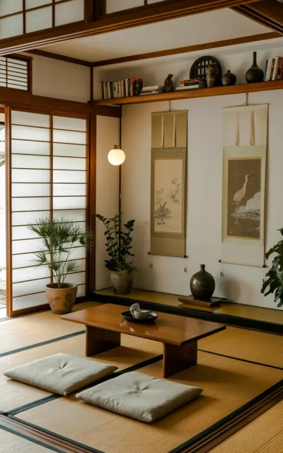
The first time I walked into a room with tatami flooring and shoji screens, I understood why people can’t stop talking about Japanese living room design. There’s a quietness that hits you before the furniture even registers. But here’s the thing: a beautiful Japanese living room isn’t just about buying a low table and some cushions. Most attempts at this style miss the mark in ways that are easy to fix once you know what to look for. I’ve made these mistakes myself, and I’ve seen them in a hundred Pinterest saves that never quite make it to the floor.
Mistake #1: Treating Tatami Floor Like It’s Regular Carpet
Ok so, let’s start with the most obvious feature. Tatami floor has a direction, a thickness, and a texture that changes everything about the room. If you treat it like a neutral beige carpet, you’re losing half the point.
The photo that inspired this guide shows clean, pale tatami mats that stretch right to the edge of the room. They’re not covered with throw rugs or layered with a giant Persian carpet. That’s the move. People will buy a tatami mat and then slam a heavy sectional on top of it, which completely kills the natural spring and smell of the rush. Honestly, if you have cats who claw things, reconsider. Tatami is forgiving underfoot but not indestructible.
Common mistake: assuming all tatami is the same. There are floor mats with a dark green edge and traditional rice straw cores, plus cheaper wood fiber ones that look right but feel like plastic. For a genuine Japanese interior, you want the real thing, even if it costs more. Your feet will know the difference.
Mistake #2: Using Shoji Screens as Decoration Instead of Light Diffusers
Shoji screens are the magic trick of the room. Those wooden frames with translucent paper panels don’t just look soft; they actively change how light moves. In the reference image, the shoji screens sit over on the left side, letting daylight pour through and land on the tatami like a lantern.
I see so many people buy a single antique shoji screen and prop it against a wall like a piece of art. That’s not what it’s for. The whole point is to place it where it can break up direct sunlight or divide a space without fully closing it off. If you don’t have a sliding door or window that needs covering, use it as a room divider between the entry and living area. But don’t just lean it there. That’s like buying a sailboat to park in your driveway.
Another angle: the gap between the wooden slats matters a lot. Coarse, wide-spaced slats throw a bold striped shadow. Fine, dense slats create a subtle haze. Go with the fine slats for a calmer feel.
Mistake #3: Pairing the Low Table with the Wrong Seating
The low wooden table in the middle of the room is the anchor, not an accent. In the photo, it’s simple, warm, and sits close to the floor, with two light gray square cushions resting beside it. That’s the entire seating arrangement. No armchairs, no recliner.
Where people mess up: they buy a traditional chabudai table (about 15 inches high) and then park it in front of a conventional sofa. Now you’ve created a weird situation where your shins hit the table edge while you slouch into the cushions. It’s not zen, it’s a chiropractor visit waiting to happen. To make this work, you need floor seating, whether that’s zabuton cushions, a low-backed bench, or even a cushioned floor chair. Your spine needs to stay upright, and your legs need room to fold.
One overly specific memory: I once spent an entire weekend measuring the gap between the tabletop and my floor cushion because my back wouldn’t stop aching. Turns out the table was four inches too high. Four inches. That’s the difference between comfortable and cranky.
Mistake #4: Hanging Too Many Scroll Paintings or Zero Scroll Paintings
The two hanging scrolls on the white walls in the photo are a masterclass in restraint. One is a light bird painting; the other is darker, more moody. They don’t match, and that’s exactly why they work. Scroll paintings are meant to change with the seasons and your mood. They’re not a gallery wall.
People either hang three or four scrolls in a row, which turns the room into a museum gift shop, or they hang nothing at all because they’re scared to put nail holes in the wall. Both are wrong. One or two scrolls, hung at eye level while you’re seated on the floor (not standing), will give the room a focal point without clutter.
And don’t go overboard with framing. Traditional hanging scrolls don’t have glass or thick frames. They’re lightweight, so they can be rolled up and stored. If you buy a scroll and never rotate it, you’re missing a nice little ritual. Swap them out with the season. A bird in spring, a dark ink brush painting in winter. It gives the room a heartbeat.
Mistake #5: Turning the Built-In Shelf Into a Clutter Magnet
Look, that built-in wooden shelf that runs along the top of the wall in the reference photo is not a trophy display. It’s holding a few books, a couple of dark ceramic vases, and maybe a small piece of decor. That’s it. That’s the whole move.
The common mistake is to fill every inch of that shelf with framed photos, awards, incense holders, little buddha figurines, and dried flowers. Then the shelf becomes a visual tornado at eyebrow level, and your calm Japanese living room suddenly looks like a flea market. The trick is to leave plenty of empty space. Negative space is not wasted space; it’s what makes the room feel breathable.
A practical rule: keep each shelf section to no more than one or two objects per linear foot. So if you have a three-foot shelf, you get one vase and one stack of books. Remember the ceramic vases in the image? They’re all dark, all earthy, and they sit alone. Let the silence sit with them.
Mistake #6: Over-Accessorizing With Zen Crap
Here’s where a lot of people go off the rails. They want a Japanese living room, so they buy every bamboo basket, incense burner, Koi fish print, and samurai sword replica they can find. That’s not zen decor; that’s just clutter with a Japan-themed playlist. Your room doesn’t need a shrine to Instagram aesthetics.
What actually makes a space feel calm is editing. If you’re unsure, start with this short list of what belongs in a Japanese living room:
- One low table and a few floor cushions
- Tatami or a tatami-like natural flooring
- A single hanging scroll or one piece of calligraphy
- A small vase with one branch, or even just an empty dark ceramic vessel
Anything else needs to justify its existence. A stack of books? Fine. But that collection of souvenir shot glasses from Tokyo? That goes in the kitchen cabinet, not on the shelf.
The Real Takeaway: A Japanese Living Room Is a Practice, Not a Product
Since we’re talking about a japanese interior, the most important thing is to stop treating it like a shopping list. You can buy the exact same tatami mats, shoji screens, and low table, and your room will still feel off if you’ve surrounded them with too much stuff. The actual magic lives in the moments between objects: the warm light from the paper panels, the slightly rough texture under your knees, the quiet pause when you sit down.
Start small. Pick one corner of your living room and change just the floor and the seating. Hang one scroll. Then sit there for five minutes without your phone. If it feels lighter, you know you’re on the right track. If it feels empty, that’s the point isn’t it? Give yourself a couple of weeks before adding anything else. Your own breath will tell you what comes next.
Leave a Comment